Data and Statistics Primer
Introduction
There are a large number of ways of looking at numerical data graphically, from simple line and bar charts to more complex box-and-whisker plots to rich 3D visualizations. In any case, the purpose of the graphic presentation of data is the same: to make it possible to easily digest large amounts of data at-a-glance as well as present a level of detail which allows the user to obtain a deeper understanding of the underlying data.
With this in mind, this primer is intended to give the reader an overview of the statistical and graphical methodologies employed in the presentation of the data on this website.
The Median
The most basic statistical method used in analyzing innovative/alternative septic system performance is the median. Simply put, the median is
“the numerical value separating the higher half of a data sample from the lower half”
and can be found by arranging a data set from lowest to highest value and picking the middle one. For example, the median of the dataset {1, 3, 5, 9, 12} is 5, since 5 separates the highest half of the dataset (9 and 12) from the lowest half (1 and 3).
Why use the median instead of the average?
In short, the median is more resistant to being skewed by the presence of a very large (or very small) outlier in a data set than the average (mean).
The table below lists out a few data sets and their corresponding average and median values.
| # | Data Set | Average | Median |
|---|---|---|---|
| 1 | {1, 3, 5, 9, 12} | 6 | 5 |
| 2 | {10, 16, 18, 25, 67} | 27.2 | 18 |
| 3 | {1, 24, 27, 34, 35} | 24.2 | 27 |
| 4 | {2, 6, 7, 45, 48} | 21.6 | 7 |
The skew-resistant qualities of the median are best illustrated by dataset numbers 2 and 3. Both contain an outlier (67 and 1, respectively) which skews the average value more than the median value.
When talking about I/A performance data, this skew resistance is important – it can reduce the effect of a very high or very low sample value that is largely separated from the bulk of the dataset. In many cases, the total nitrogen startup sample or first sample of a seasonal I/A system’s operating season can be much higher than is typical for that system. The median helps to reduce the non-representative effect of a single highly elevated effluent total nitrogen sample.
Presenting I/A Data Graphically
Data can be presented graphically in a myriad of ways:
- Line charts
- Scatter charts
- Bar and column charts
- Area charts
- Histograms
- Pie charts
- Treemaps
- Bubble charts
- Box-and-whisker plots
- Sankey diagrams
Selection of a chart type is highly dependent on the type, volume and range of the data to be presented. For example, while a line chart may be great for showing a few data series, it can quickly become cluttered and unreadable with the addition of more data series.
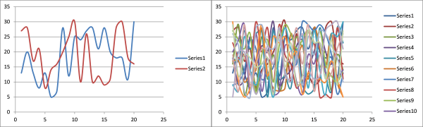
When dealing with I/A data, we are typically looking to compare the sampling results of one system against another or many other systems. As illustrated above, merely plotting effluent total nitrogen results for multiple systems is an exercise in futility.
As a result, the majority of I/A performance analysis is done with two types of charts, the histogram and the box-and-whisker plot.
Using Histograms
 Histograms are a bar-type graph used to illustrate the distribution of a dataset. Each bar represents a “bin”, containing the frequency of occurrence of that bin’s value within the dataset.
For example, consider the dataset {1, 4, 7, 12, 18, 24, 28, 29}. If each bin were ten units wide, bin 1 would be 3 units tall, bin 2 would be 2 units tall and bin 3 would be 3 units tall.
A great example of a histogram (and it’s cousin, the probability density curve, is this display at the Boston Museum of Science:
Each of the bins catching balls falling from the top of the display constitutes a histogram bar. As the machine runs, each bin collects a number of balls (the frequency). Bonus points: the red line on the display represents a normal or Gaussian distribution.
How do Histograms Apply to I/A Data?
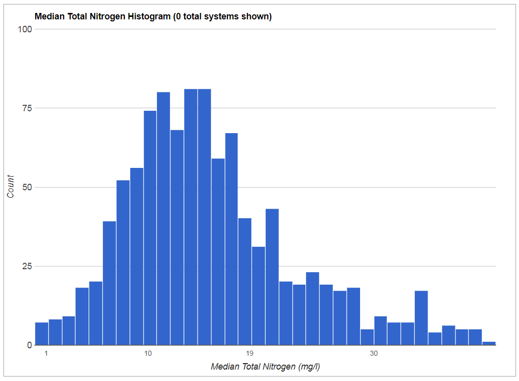
The question is frequently asked – “how many I/A systems have a median of 19mg/l effluent total nitrogen (TN)” (More on the 19mg/l TN standard here)? The obvious easy answer is to calculate the median value of effluent total nitrogen for each system and then count how many are 19mg/l or below.
The better answer is both more complicated and much more useful. Create a histogram of the medians and you can easily find the number of I/A systems meeting any TN effluent standard.
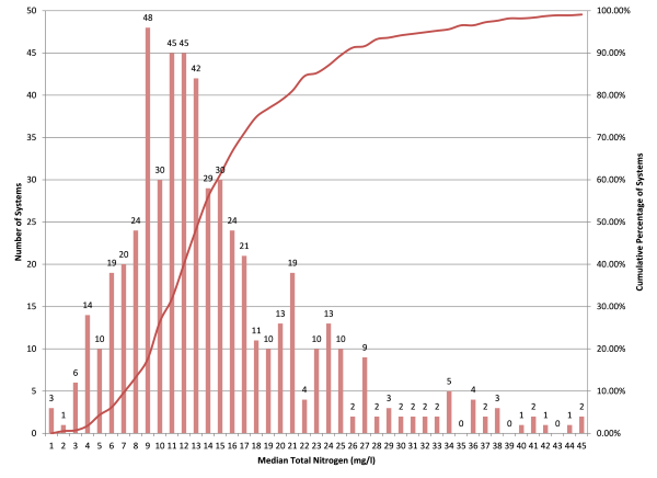
The above chart is actually a two-for-one – containing a histogram of total nitrogen medians and a “cumulative frequency polygon” (a fancy name for a line graph, essentially). The line graph is created by adding each bin to the next from left to right and is expressed as a percentage of the total number of systems. For example, the first bin is 3. Add that to the second bin to get four. Add four to the third bin to get 10, and so on.
This chart can be used to find the number of I/A systems meeting any chosen total nitrogen standard by drawing a line up from the bottom of the chosen bin up to the red line, the hanging a 90-degree right turn to intercept the right-most y-axis to find the number of systems meeting that standard.

For example, to find the number of I/A systems that have a median effluent total nitrogen value of 19mg/l or less, follow the green line up from the x-axis and across to the y-axis. The result shows that about 77% of the systems meet 19mg/l or less. The blue line represents the same exercise for 10mg/l or less, resulting in about 26% of systems.
From a practical standpoing, using the data collected by this database and this analysis technique can give an idea of how many systems might be able to meet a certain regulated effluent total nitrogen concentration.
Using Box-and-Whisker Plots
 While using a histogram to analyze median values is useful, it is also necessary to look at more than a single calculated quantty for a system to fully understand the system’s caacity to remove nitrogen. Enter the box-and-whisker plot.
The box-and-whisker plot is composed of three main parts and one optional part:
- The box
- The whiskers
- The median
- Outlier indicators (optional and not shown)
The Box
The box in a box-and-whisker plot is representative of the range of the middle 50% of whatever is being measured. In statistical nomenclature, this is referred to as the “interquartile range”, or the range between the second and third quartiles. For example, in the dataset {2, 4, 7, 10, 15, 23, 25, 29, 34, 36, 42, 46}, the middle 50% would be {5, 23, 25, 29}.
When it comes to plotting I/A performance values this way, the box gives an idea of the consistency of performance – a squashed box means the system is performing right around the median value at least 50% of the time. A stretched box indicates that an I/A system has a large amount of variability in total nitrgoen performance.
The Whiskers
The whiskers can represent a number of things, depending on what type of box plot is presented. In the simplest form, the whiskers represent the minimum and maximum values in a data set. If outlier indicators are shown (typically as small circles above or below the whiskers), the whiskers can represent a variety of ranges, from one standard deviation above and below the mean to between the 9th and 91st percentile of the data.
I/A box plots are typically presented with the whiskers representing the minimum and maximum values. It is worth noting that in many cases of I/A performance box plots, the upper whisker tends to be representative of the “startup” sample, the sample taken right after system installation is complete and the system has been turned on. This “startup” sample comes back high in many cases.
How do Box-and-Whisker Plots Apply to I/A Data?
Box-whisker diagrams stand out as an ideal way to display differences between the performance of individual I/A (Innovative/Alternative) septic systems “at a glance”.
 In the figure, the “x” axis represents individual I/A systems, while the “y” axis plots total nitrogen values in milligrams per liter. In the state of Massachusetts, most I/A systems are held to a 19 g/ml effluent total nitrogen standard (shown by the dotted red line).
System “A” is an example of a well-performing system. All total nitrogen values fall below the 19 mg/l standard, and the box is compressed, indicating the middle 50% of values fall in a small range. In terms of I/A systems, a compressed box indicates consistent performance.
System “B” is an example of a system that usually performs well. Most total nitrogen values fall below 19 mg/l, but there may have been a high result at some point. Typically a far-outlying maximum whisker indicates a system startup sample. Also note that the box is a bit stretched, indicating that this system may not be performing very consistently.
System “C” represents on that is “on the cusp” of being a well-performing system. The box is a bit stretched and the median is falling above 19 mg/l.
System “D” could be called a “consistently poorly-performing system”. While the box and whiskers are nice an compact, all results are well over the 19 mg/l standard.
By considering all parts of the box-whisker diagrams for I/A system performance, one can get a pretty good idea of how well a system is performing. The caveat is that the nitrogen output of an I/A system is entirely dependent on the nitrogen input. To truly assess performance, an effort must be made to determine how much nitrogen is coming into the system (which is an entire topic on it’s own).